Setting up the perfect TV dashboard is somewhat of an art that is often overlooked and performed poorly. Yet we depend on these screens for our day to day business more and more, so why wouldn’t we want to ensure we’re getting the most out of these business critical tools?
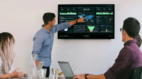
Here’s a common situation. Someone suggests in a meeting that we need to put a few dashboards and reports on display around the office so the team can stay on top of events as they happen, and so we can get insights into performance measurements at a glance without needing to login to a tool and manually review the dashboard.
This was initially just a small selection of Power BI dashboards on rotation with a few sales charts thrown into the mix.
Soon after, we have multiple TV dashboard screens on display rotating through a somewhat arbitrary collection of charts, reports and content that was hastily decided on without any real consideration.
A few weeks go by and it’s clear we need to make some changes, add more dashboards, fix some of the display timings. Some are shown too quickly, others need less time on screen, yet no one seems to touch it, nor does anyone know where the keyboard and mouse has gone or how to actually update the TV dashboard software.
Sound familiar?
Don’t worry, we’ve got you. Here are our top eight tips for TV dashboard productivity to ensure you’re getting the most out of those screens.
- 1 Avoid long rotation lists for critical information
- 2 The “at a glance” rule
- 3 Use visual cues to highlight data
- 4 Schedule what’s important, when it’s important
- 5 Mix in digital signage
- 6 Screen visibility & viewing angle
- 7 Use remote control for screen management
- 8 Always set thresholds & alarm levels
Avoid long rotation lists for critical information
That single TV dashboard screen in the middle of the office started out well when there was just a handful of dashboards on the rotation, but now a year down the track the number of dashboards & reports has tripled and our most critical performance metrics are only on display for a few seconds every 10 minutes.
Let’s take an example. Say we have 5 dashboards that contain critical business metrics displayed for 60 seconds each. For every 5 minutes that pass, each one is visible on screen for a full minute.
Now over time we’ve added more dashboards: some less critical, some for purely digital signage reasons such as date, time or news feeds. Now we have 15 screens, again displaying for 60 seconds at a time.
That critical metrics dashboard you originally set this TV up for is now only on screen for 1 minute out of every 15, which is 4 minutes per hour. If you’re not looking at that exact slice of time, you may miss something critical.
The fix is simple: keep your rotation lists short, and instead of adding more and more onto the same rotation, break them out on to additional TV dashboard screens.
In our example above, by simply adding a second TV screen we can display 7 dashboards on one and 8 on the other, which only slightly reduces the time on screen for our most critical reports. It also gives you the option to put critical reports on one screen and lighter digital signage content on the other.
Rule of thumb. Keep your dashboard rotations under 10 minutes in total, with each dashboard showing for 30 to 60 seconds.
If you’re using VuePilot to display your dashboards, there is a little running time indicator on the edit rotation screen to help you keep track.
If your TV dashboard software has the option, you may also consider using scheduling to hide certain dashboards from the rotation during certain times, which improves your ToS for critical content. More on scheduling in tip 4.
Depending on your choice of TV dashboard software this may increase the complexity of managing rotations. A multi-screen solution that lets you control and update multiple screens simultaneously is highly recommended here. See how to manage multiple dashboard screens from one machine for more information.
The “at a glance” rule
Keep complexity low so people can recognise the data without thinking about it.
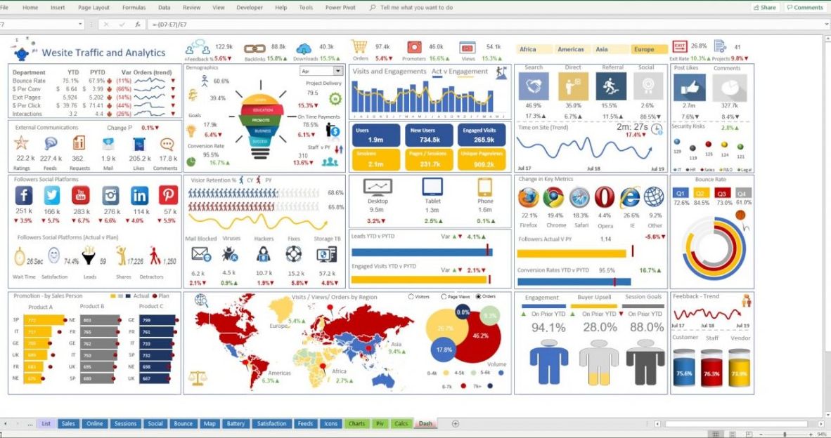
It’s tempting when designing dashboards and reports to cram as many charts and figures into a screen as we can. More information is better, right? Not necessarily. In fact, in many cases you’re worse off.
Sitting directly in front of a large 27″ computer monitor is very different to viewing a dashboard on a TV from 10 meters across the room. A good test when designing your dashboards is to step back from your monitor a few paces and see how well you can still read what’s on screen. You’ll likely find you can’t read the text anymore, but you can still make out colours, shapes & charts.
To put it simply: design your dashboards for either the big TV dashboard screen or the desktop computer monitor in mind. Avoid spreadsheet-style tables unless you’re increasing the font sizes significantly. Give sections of the screen padding so the eye isn’t overloaded.
 Avoid
Avoid
 Do
Do
The golden rule. You should be able to interpret what’s on screen, at a glance, from across the room. Wandering past on the way to a meeting? You should still get the picture in a second or two.
Use visual cues to highlight data
Following on from tip 2, we can improve our “at a glance” performance by using more visual cues that draw the eye from afar. A good example is the use of sparklines or stock-market style red/green arrow indicators that can be parsed from across the room more easily than a table of text and numbers.
Shapes and colours are easily identifiable and should be used to complement text-based information. The presence of a simple downward facing red arrow or a red traffic light indicator catches your eye far better than some black text on a white background that says “89%”.
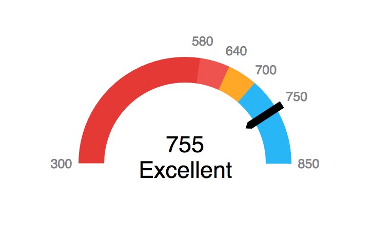
Instead of displaying large numbers, try displaying a gauge. The gauge can represent several different metrics at the same time, such as when measurements are very low, when they are very high, or when they have crossed some sort of threshold.
If adding elements like sparklines or arrow markers is not possible, consider simply changing the font colour to an orange or red to highlight important figures. The colour alone will be enough to draw your attention, after which you can just step closer to inspect.
Schedule what’s important, when it’s important

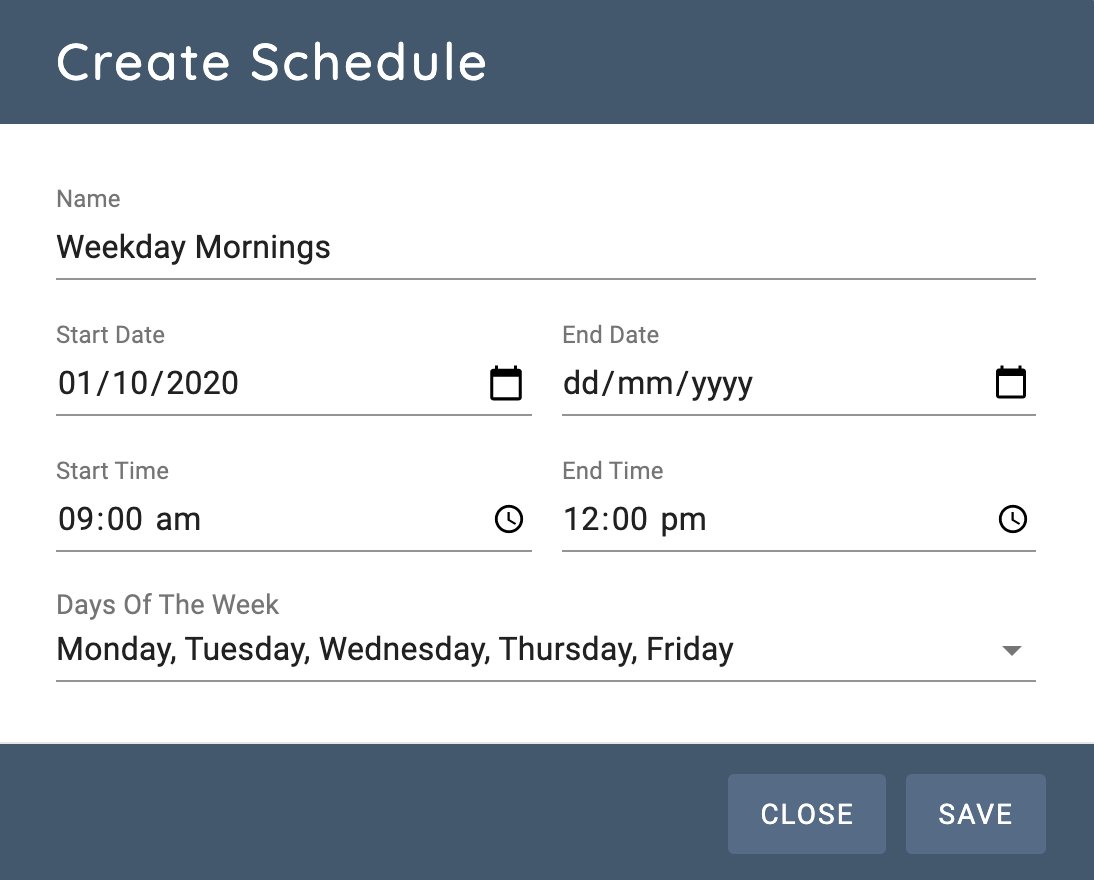
This will depend on your choice of TV dashboard software, but if your software allows you to schedule when certain content should be on screen and when it shouldn’t, this can be a powerful tool for improving the effectiveness of your TV dashboards.
Businesses with critical operating hours (stock traders, retail-oriented teams, operations teams, or businesses that have rotating teams of staff) will often benefit from being able to display critical information based on time of day, day of week, or team on shift.
We talked about Time On Screen in tip 1, and the ability to schedule content at times that are critical to your business is a powerful feature that is often overlooked.
Example: day shift vs night shift IT
An IT department for a major online retailer is likely to have dashboards detailing web traffic, throughput, server loads and resource consumption on screens in the IT area. They depend on these screens between 8am and 8pm each day.
At night however, another engineering team comes on as a night shift and performs maintenance and change tasks outside of peak operating hours. They’re less concerned about traffic throughput at 11pm, but they care a lot about database performance and disk read speeds since they’re running large backup operations.
You could have each team manually change the rotation when they start their shift, but that’s cumbersome and someone has to remember to do it. A much better solution is one rotation containing every engineering dashboard, with a schedule per item, and no schedule on the ones that should always be visible.
Mix in digital signage
Break up the monotony with engaging informational content, not just dashboards.
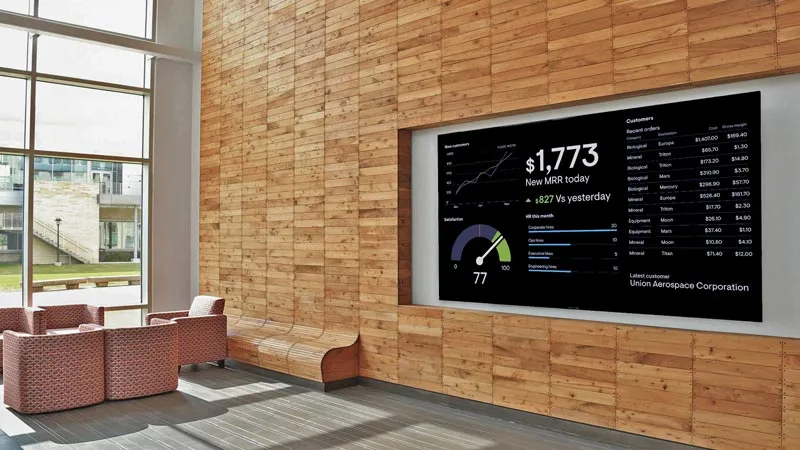
TV dashboard screens that are on display in the middle of the office can make great digital notice boards. We don’t need to resign them to displaying boring charts all day; we can use them to convey all sorts of information that may be useful to everyone in the company, not just your team.
Things you might add between reports:
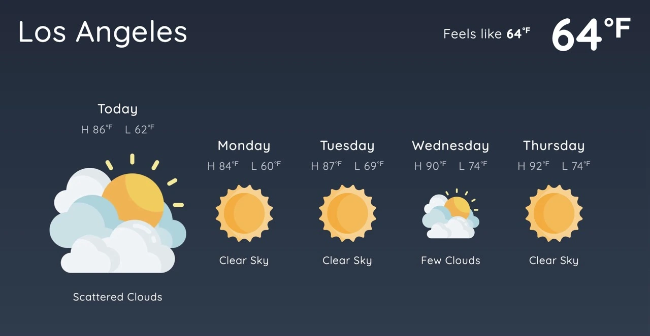
Adding a few of these into your regular dashboard rotation is a great way to break up the monotony of endless charts and numbers. Simply displaying the latest tweet from your company’s account or flashing the weather on screen for 15 seconds is a nice way to provide interesting information in a stylish way.
Some examples of digital signage screens using apps.
This will depend on your choice of TV dashboard software. At VuePilot we provide this functionality in the form of “apps”: prebuilt screens you can configure and add to your rotations in seconds, creating eye-catching and engaging displays.
Screen visibility & viewing angle

This may sound obvious, but it’s surprising how many companies place TV dashboard screens in corners and out-of-the-way places that make them hard to see. If you can’t see the screen, it’s really not very useful to anyone.
- Placing the screen next to a window that gets full sunlight every day.
- Mounting around corners or out of the way to hide cables.
- Putting screens in rooms that are rarely used.
- Mounting in a position with no line of sight to common areas.
- Using old faded screens with poor contrast.
Place your TV dashboard screens in places with high foot traffic, where they will actually be seen.
If you’re concerned about cables or an ugly box being on display, consider using a small device like a compute stick or a Raspberry Pi to clean up the appearance and tuck it away behind the screen for a streamlined look.
See our TV Dashboard Guide for more on small display devices and when to use which.
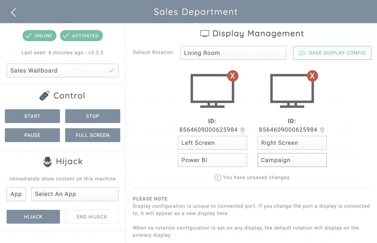
Use remote control for screen management
In many cases our screens will be wall mounted or at very least placed in a somewhat difficult location to access. You’re not going to want to leave a keyboard and mouse permanently connected to those screens, and let’s be honest, plugging them in to update the rotation is a pain.
When choosing TV dashboard software, consider how you’re going to update these screens. The ability to remotely manage what’s on screen and update rotation lists without physically being at the screen can be the difference between an up-to-date dashboard and an outdated, stagnant screen that no one can be bothered to update.
Remote control software should also let you start, stop and pause rotations. Pause is especially useful when you want to focus on a particular dashboard for a few minutes to analyse something. Pause, gather the information, resume.
Remote & bulk rotation updates
Updating items in a dashboard rotation list remotely is a huge productivity booster. Say you have 10 screens in various departments. Each has contextual dashboards for its team, but all of them share a few common dashboards relevant to the whole company.
Adding or updating those shared dashboards means updating 10 machines attached to 10 screens, a huge amount of duplicated effort. Being able to update several rotations at once from a central location turns that into a job that takes a few seconds.
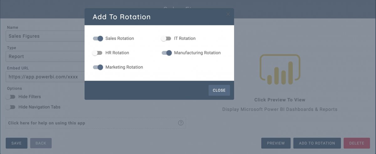
Here’s what that flow looks like in VuePilot:
- 1 Create a new Microsoft Power BI report you want to display on 6 screens across several rotations.
- 2 Create a VuePilot Power BI app from the dashboard to display the report on screen.
- 3 Click “Add To Rotation”, then check off every rotation you want this report to appear in.
- 4 You’re done. Took less than a minute, didn’t leave your seat.
Remote machine & screen management
Controlling each screen individually from a centralised dashboard and managing what’s on display with a few clicks eliminates the need to physically access the machine and configure which rotation goes on which screen for multi-screen setups.
It should realistically take no longer than a minute to update every screen in your workplace so you can get back to work.
Read more about how to remotely control TV dashboard screens here.
Always set thresholds & alarm levels
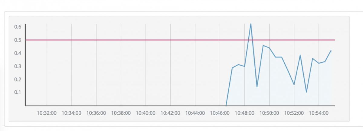
When it comes to dashboards and reports, a huge screen full of charts is often hard to decipher. We mentioned the “at a glance” concept earlier, but bright colours and bold lines are only useful when they have context. That context is represented in the form of thresholds and alarm levels.
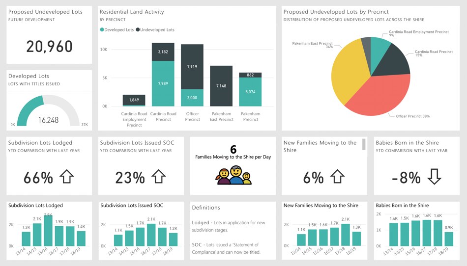
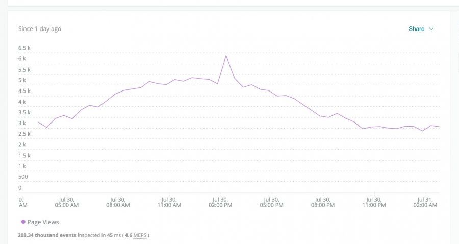
Take a Power BI dashboard full of charts and numbers. What does 1252 mean? How about 65%? Without a threshold there’s no context as to whether those numbers are good or bad. The only people who really know are the few who created the report.
It seems obvious, but it’s actually quite common to see dashboards full of charts with no context and no reference as to whether the numbers are healthy.
Set thresholds. Even if you don’t have solid numbers to go off, give yourself a guide for what’s acceptable and what’s out of the ordinary. When displaying large numbers on their own, have them change colour when they cross a threshold.
 With threshold
 No threshold
Is the peak at around 5,000 page views normal, or higher than usual? You can begin to see how that simple red line of context makes a big difference.
Make those screens earn their wall space
The common thread across all eight tips: TV dashboards work when they’re built for the room they live in. Short rotations, big visual cues, scheduled context, and remote control turn a passive screen into a tool the whole team actually uses.